Welcome to my addiction!

Thank you for stopping in and looking around. I am an admitted paperholic and try to participate in all things stamped. In the past I have taught classes on unique techniques at our LSS and have loved every minute of it. My mind continues to want to create and share. I garner my inspiration from fellow bloggers, our LSS, and some of the horticulture magazines that come in the mail. Simple pleasures in life make me smile and that includes a simple yet elegant card or piece of paper that I see potential. Please feel free to share your work with me as I share my work with you. Enjoy your visit!


Monday, October 31, 2011

Wishing Two People

Good Evening everyone!
    Well my card today is a Wedding card.  We just found out that a young couple of our church have decided to get married and it's in just two weeks (they have been dating for four years).  So since I am not one to wait, I jumped right on this one!

Since it is a fall wedding, I wanted to use subtle fall colors.  The panels in the forward background were embossed with Spellbinders Flourish Impressibility panel.  The larger of the three flowers is a homemade embellishment as well as the leaves and branches.  The medium roses are princess roses  that I sprayed with Lindy's Fuzzy Navel Peach Stardust spray.  The smallest flowers are from Wild Orchid.  The lower edge was punched with Martha Stewart.  The butterflies are also MS punches.  The tag is also SB Fancy Tags, the center sentiment is from JustRite Stampers.  I wanted to keep this simple and elegant.  The kraft paper cs (Paper Trey Ink) is layered on an eggshell Bazzil cs. The Fancy Tag was cut out of some Club Scrap cs scrap that I had around and helped tie the back paper to the front.  Tim Holtz Distress Ink Antique Linen was used to shade the eggshell paper in the raised parts of the embossing.  Finally some antique eggshell lace was draped across the upper right hand corner.  Before the final embellishments were added everything was sprayed lightly with Heavy Metal Shimmeringz for a glimmery finish.

That's it for tonight, hope you enjoyed your visit.  I'll add all the challenges this has been entered into in the morning.  Thanks for stopping :) 

Blessings.


This card has been entered into the following challenges:
Card Making Mama's:  Cards Only, Die Cuts,  Craft your Days Away:  Autumn Colors,  Crafty Creations Challenge: Leaves or Fall Palette,  Friends of Speedy: Use Scraps,  Joyful Stamper: Anything Goes, The Paper Shelter: Anything Goes, Patties Challenges: Halloween or Fall colors,  Creative Craft Challenges:  Fancy Edges,  Paper Pretties: Use a Sentiment


Sunday, October 30, 2011

My Tribute to Breast Cancer Awareness

We are in the last days of October, a month that has the great designation of Breast Cancer Awareness Month.  In other words "Pink" month.  This has special meaning to me because I am a survivor.  In 2006, October, I had my usual check up, but things were all so usual.  By the middle of the next week I was in for a biopsy and a week later was in the hospital for a lumpectomy.  I thank God for each opportunity that He gives me to witness about the comfort and Grace of my Heavenly Father.  I can't tell you how important it is for each and every woman to have regular check-ups.  I did and we caught mine, if we had not caught it, because it was in the lymph nodes, the end could have been much different.  Survivors have the special privilege of having required check-ups at least every 6 months, and I make those too.  God is good, He has blessed many men and women with the brains and integrity to become doctors.  To diagnose, find and remove cancer cells, tumors, etc.  Then there are reconstructive surgeons who do their part in making women who have mastectomies feel and look nearly normal again.

So here is my card.  My Pink card as a tribute to Breast Cancer Awareness.  Pink is in!


As usual I have sprayed this with Tattered Angels so the sparklies make it harder to take a great picture.  To give an idea of depth I took a picture from a different angle.


I made both flowers by hand, the lower flower just by taking a 12" strip of paper at 1 1/4" wide, scored every 1/2".  The little flowers are just small punches that I have cupped and layered to give a small bud look to.  The upper flower was an attempt at making a mum centered whimsical flower.  The die cut branches, leaves and swirls are Marianne and MFT.   The hat pin I made again with whimsy in mind. The cute jeweled butterfly is the perfect addition to the cute littler flowers. Most of my hard embellies like pearls and the hat pin are from my favorite spot - PizzazzAplenty. Finally there is a verse of encouragement on the inside from ODBD.  The bright center in the flower is from Stickles.

The end of October is here, but that doesn't mean taking medical responsibility of your body is over, or it's to late for this year, "I'll do it next".  If you haven't had your appointment for this year yet, stop.  Take the time to do it now.  If you have kids, do it for them, Every child deserves to grow up with their mom ;)  Blessings and special love for those of you who are survivors as well <3

Thanks for stopping by!
                                 
This card has been entered into the following challenges:
Charisma Cardz: Anything Goes, Craft your Passion: Flowers and Bling, Crafty Ribbon Challenge: Bingo (all but Lace),  Our Daily Bread Designs: Pink

Friday, October 28, 2011

Art Log Journal and Gift box

After weeks of work, lots of redos, much thought and contemplation I am finally finished with my gift for my friends daughter.  There are lots of pictures so I will keep my comments short and sweet.  If you don't like long blog entries, please feel free to skip this one.   In an earlier post I showed you the outside of the journal's storage box.  Now I starting at the point of opening the box and peeking inside :)
When you open the box your will see that the top of the inside is decorated with some ribbons and a verse.
Laying inside the box bed is the journal.


The journal was measured to fit precisely inside the box.  So although the pages may seem a "strange" size, they are that way for a reason.  Now I will pull the journal out of the box so you can see the pages.

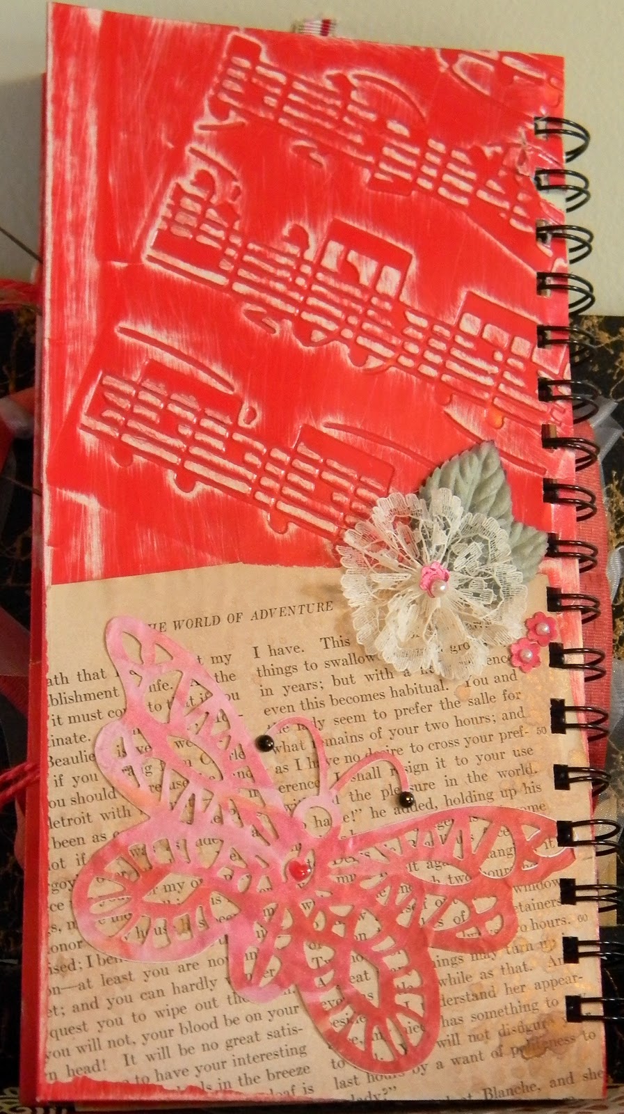
The cover page is the inner half of a report folder that has been sanded, sprayed with Tattered Angels mists, adorned with a remixed sizzix die cut, with a title square layered on a gold adorned clear label surrounded with red stickles.  The TA makes the front cover very shiney, but I couldn't get a good picture of it.
 Opening the first page:

You see the pocket of the folder with some words of encouragement and wisdom (Verve) The inside of the folder is lined with a matching red & white DP and a small black tag folder placed inside.  The opposing page has been stamped all over with script of varying sizes, larger at the top, smaller at the bottom.  Die cuts from Marianne and MFT were treated with Lindsy's Stamp Sprays, the edges of the page were dipped in Ranger's Gold EP and heat set.  The upper right corner was stamped with moth to butterfly progression stamp., each type of moth was embossed in a different EP from Shimmerz.  The tag on the left side opens up


This is the tag book opened up.  Both sides have room for her to either journal or put a picture of a friend or something special, both sides have words of encouragement.  Everything is done in silver EP or Silverfoil papers.  The butterflies are silver charms.


The next set of pages are for putting in pictures and/or journaling.

The butterfly on the left page was stamped on vellum twice, embossed with black EP and halogen highlights, then the spaces between were done with Tim Holtz's Alcohol inks.


The next page is just a "sweetheart" page, not sure if she even has one, but she can always put in a couple of good friends or something :) 
Both of the tags remove so she can either journal on one side and put a picture on the other or do what ever she wants. 

The next page is a three way folding panel with a verse on it.  Again for journaling, pictures or whatever. the closure is a flower shaped paper clip.


Turning the page brings us to another journaling page with a pocket and then next to that is a piece of Strathmore Watercolor paper for her to do what ever she would like on. 

On the other side of the watercolor paper is a very thin paper that I got from Club Scrap, it's not vellum, but it is pretty close.  I lightly stamped Paper Trey Ink's Violet in Distress Ink Spun Pink, again usable for placing a pic with hidden  journaling if she wants or she can put the pic on the inside and journal on the front.

On the inside I have "hidden a couple of verses as well.


Room for more journaling, tags remove and both sides are usable.  Next page is reminescent of my love for music and also the 23rd Psalm, embossed in Gold.

The next page is my favorite.  I did alot of embossing and everything is reflective.  Of course there is the peacock feather, the sun in the coner reflects the rays of the feather and the change in colors, the background has different color feathers floating downward, each feather is a color that is in the real feather.  The background has been sprayed with Tattered Angels.  Then . . .
Behind the eye of the feather, is the eye of Isis.  I so enjoyed making this page with it's subtle references back and forth.

This next page is an envelope to keep "special" things in, graced by a vintage swimsuit photo with another verse embossed on it.
The last page of the journal is more journal space and tags.  On this last page her name is on the tag in bubble letters, something fun and whimsical.  A small painted flower on canvas graces the lower right hand corner.  That didn't turn out quite like I liked, but sometimes our greatest critic is ourselves, someone else said it was fine, so I let it be.  Last page

is back to being light and lacey with a lacey butterfly, with a lacey flower set on a page from a book that I keep just to use it's pages on something like this.  The folder was embossed with a music folder.  All pearls, rhinestones, charms etc found throughout this Journal are from PizzazzAplenty.  I made one BIG mistake in making this journal.  The center page.  I created a beautiful center folder that is not in the book because it wouldn't fit in my zutter after I had textured and embellished it.  So you take lemons and make lemonade.  I placed the folder in the bottom of the bed of the box, she can keep some other type of memorabilia from her first year in college in it. 

The exterior has textured gesso gracing the corners like icing.  Sprinkled with micro beads and glitter from bedazzels.  On the upper left corner is real hydrangea flowers from my large shrubs out in the yard, the same one that my picture is taken by.  Here is a quick close up.

Again, it was all spritzed with Tattered Angels to give it even more sparkle.  The inside has some beautiful homemade paper.
The paper is beautiful IRL.  I tried to take a pic to do it justice, but, it just doesn't show the shine and sparkle.


finally a beautiful woman, embracing life, something I hope and pray this young woman does.  Learning all she can now while in college, and later as she continues in life.  Be free in the Spirit, comforted by the hands of her Father, and Embrace the life full of Grace that He has provided. 


The inside of the bottom of the box, more sparkles and dazzles.  This was a lot of fun making, and this weekend she should be home to visit and I'll give her the box and journal then.  Hope she enjoys it as much as I enjoyed making it.  Hopefully you enjoyed looking :)  Have a wonderful evening.

Blessings!
                     

Tuesday, October 25, 2011

Yes, I know we are going into fall and not into spring, but I do so love coloring flowers and this tulip was calling my name and the prisma pencils and just a few copics. As you can see, it kind of has a sketchy type of feel to the stamp so I didn't want to do a "perfect" coloring job, but rather something that looked like it was being sketched in color as well.  A few of the challenges out there are looking for lots of layers, and if you look at this card, you can see it has lots of layers :)
My hubby supports my card making/playing part of life, but when I send out these cards they are so heavy with all the layers that it doubles and sometimes triples the price to send them as you well know.  And so does he!  He is always telling me to decrease the number of layers, save the trees, save the planet and save our life retirement.  He is just to funny sometimes.  I feel quite lucky that he supports me like he has over the last 20+ years of scrapping and card making.  Oh well, back to the card.  Here is the full picture of this one.
I never seem to have enough encouragement cards and keep making them as quick as I can.  This one and several similar took a few minutes to make, but they all look so very nice (IMPO)  I almost felt this needed a bow, but couldn't figure out where to put it without making everything look off balance or to cluttered.  Hope you enjoyed peeking at todays project.  Tomorrow I will be putting up the Art Log Journal that I made for Cori Beth.  Until then, have a wonderful evening. 

Blessings to all!
                         

Sunday, October 23, 2011

Fall Colors

Good Sunday Afternoon all!

The weather here has been so lovely lately.  So nice in fact, that last Sunday my hubby asked if I would like to just drop everything and go take a ride with the top down in the beautiful sunshine and smell the scents of fall.  Needless to say, I didn't need a second invitation.  The ride was sensational, so exhilarating, so romantic.  I love fall, just as I adore spring and summer.  For me it is the years last "hurrah!" before winter comes and puts everything to sleep.  I am not into Halloween, but Fall colors are some of my fav's.  Over the last couple of days while I have been working on my multi-media project I have told you about, I have made a couple of cards of which I will share with you in the next couple of days.  They resonate the Fall symphony of colors that we enjoyed last week and this next month as trees are just starting  to turn colors.  We are a little behind those who are north, but at least we are finally in the last throes of fall.  So take a moment and see what I have done, then head outside to find your inspiration.

My original inspiration came from a piece of paper that I had cut out a leaf from for another project and some brocade type lace the had at Hancocks.  I usually cut out my items that don't have dies with an Exacto knife, so you can see as I get closer that there are a few small overcuts.
 I started the card base with some fallish print cs from Club Scrap, that was layered with some black cs (PTI) that I had brushed and swirled., The next layer is the piece with the leaf cutout.  While I was busy painting the gold on the black cs, I decided to do some small stamping on the burgundy cs piece that the leaf had been cut our of.  Then I punched the sides with a MS punch and adhered the brocade.  It looked to plain, so I decided that a flower with the fall mum colors would be good.  So I took some pages from a book I purchased specially for the printed pages, inked them up randomly and then cut them out with the Spellbinder's Peony die.
 I sprayed some Tattered Angles on the paper and also some water so that I could lightly crumple the paper to give it some texture.  I put it all together with a sparkly brad that I picked up years ago from Oriental Trading Co.  The stem is from Marianne.  Also on a plain green Bazill cs that had been sprayed lightly with Tattered Angles.  The final touch was adding 3 clear Dew Drops to the top left corner to balance everything out.

Now I am off to work on my other project, of which I am almost finished, I think :)  Have a wonderful Blessed day and I'll be chatting with you again soon!  Thanks for looking!

Blessings,
 This card has been entered in the following Challenges:
Top Tip Tuesday  --  Layers upon Layers
Totally Paper Crafts  -- Layers
Colour Create Challenge -- Burgandy, Black, Gold & Cream
                 

Wednesday, October 19, 2011

A Gift for a dear person

Several years ago I was in a fairly bad car wreck.  I lost the use of my feet and legs for nearly a year and still don't have full use of my right foot anymore.  There were some really dark times during this period.  I am a horticulturist, I love the outdoors, I love animals.  Now I was basically housebound due to the fact that wheel chairs don't really go through the grass very well, and traversing 6 + acres on your hands and knees just isn't very realistic.  I have a friend who's daughter came over several times.  As a family they brought over meals for us several times to help alleviate the pressures and demands on my husband as he had not only my regular duties to take care of on top of his already huge list, but he had to take care of me as well.  Cori Beth came with her mom bearing gifts of culinary delight for me each time she came.  I cherished those gifts greatly at that time.  Now Cori Beth has gone off to college, she is quite a ways from home and her family life was always close, so distance does make this new journey in her life just a little harder.  So I have been making her a little Art Journal to keep a record of this up and coming year.  To hold this journal I have "re purposed" a wooden cigar box.  I will show you the Cigar box outside as it is pretty much complete at this point
First I painted the whole box black, then sprayed it with Gold decor String.  Then I wrapped the entire box with 1 1/2" pleated black ribbon, and wrapped that with a lace that had a pearl string tied into the middle of it.  Next I put on the legs/feet that Tim Holtz designed.  They give such a nice continuance to the feeling of the box.  Finally I put a Crown front and center by the box opening divit, for the little princess who helped reach me in my dark pit.
Here favorite color is red.  Her prom dress was my inspiration here.  Her dress was a beautiful red with lace and lots of sequens and rhinestones down the front.  To emulate the dress I used Bedazzles to brighten up the top of the box, and added a metal embellishment that I have had for years and just couldn't find the right place for it.  Here it fits perfectly!

She looked rich and I wanted the box top to be rich looking as well.

With Lots of details, I am hoping this gift will make her smile as she journals about things that make her happy and smile as well.  Thank you Cori Beth for inspiring me, now I hope I inspire you ;)

Blessings,
                    

Distressed Thank You Card

Good Morning Everyone!

Well, ok, so my tomorrow morning is a day late, somehow the day just seems to get past me before I get a chance to do everything.  It also doesn't help because my computer is just a little old and VERY SLOW, so for me to even just pick up my email takes hours instead of minutes.  Oh well, no time to complian, and lots of time to smile :)

My card today is a Distress card  that I was originally doing for a challenge, but time ran out before I managed to get it finished.  As I played with this card I found a technique that I had forgotten about and wanted to play with again.  Here's the card.
I love to distress edges, I have a tool to do it with, but somehow it has gotten misplaced during my "cleaning up" process.  So this card was distressed with an open pair of scissors. I actually like the look of it better because sometimes the edge cuts the paper deeper and makes it really look distressed.  The designer papers are PTI, cs is Bazzil.  SB long rectangles in the second, third and fourth sizes.  I wanted to do some embossing, but embossing tends to give finished/polished look, not necessarily a distressed look.  So I took my VersaMark pen and just randomly stroked up the rough edges, then dipped it into the pile of EP in the container, and then immediately hit it with the Heat gun.  As soon as the EP melted I threw it back into the EP and heated it again, I moved the VM Pen to another side and then the corners and repeated this process until I have a very worn, distressed look in the EP's to match the rest of the distressed look. 


You can see some of the EP and destressing pretty well in the picture and the very sparkly EP.
To finish everything off as I lay the card together I pulled out a tape embellishment for lamps with dangling beads. 

It was the perfect fit for this with it's irregular sizes and looks.  I still needed just a touch of something for balance and a small bow was the final addition.

As I progressed through the card I also found other embellishments that added little touches here and there.  A couple of Spellbinder die cuts to give some 'umph' to the plain DP were inked and distressed.  The upper right hand corner still needed something so I found three small pearls up there to help give balance as well.  My final addition was the banner and Thank you stamp from LOC and the die from SB.  This was treated the same way that the larger pic of the flower was done.

Thanks for looking, and may each of you have a wonderfully blessed day :)